Random Reviews: Youngblood (The Image Review-lution, Part 1)
Image Comics' first series is a better representation of the company's enduring legacy than its own artistic merits
—by Nathan on October 12, 2023—
In the very early 90s, Marvel employed three celebrated artists named Rob Liefeld, Jim Lee, and Todd McFarlane. The bestselling first issue of McFarlane’s "adjectiveless" Spider-Man series led Marvel to try and replicate that success with the first issue of Chris Claremont and Jim Lee’s “adjectiveless” X-Men series, netting themselves the highest-selling single issue of all time, a record unbroken to this day. Selling over 8 million copies, X-Men #1 swallowed up records held by McFarlane’s Spider-Man #1 (2.5 million copies) and Liefeld’s X-Force #1 (5 million copies). For their efforts, these creators argued for greater creative control over the books, as their contributions were making Marvel so much money. If Todd McFarlane wanted to stab out the Juggernaut’s eye, man, let him stab out the Juggernaut’s eye! Marvel declined their wishes.
Seven creatives later left Marvel to form their own company, Image Comics. Liefeld, Lee, and McFarlane, along with Marc Silvestri, Erik Larsen, Whilce Portacio, and Jim Valentino, desired to make a company where creators kept control of their work without fear of interference from each other. In the decades since, Image has produced multiple hit series, including Invincible, Saga, and the Walking Dead. I’ve reviewed a few Image properties recently, including Huck and God Country, but for the next seven posts, I want to touch on the original series Image launched shortly after their inception.
As I mentioned in my first "Random Reviews" post, I don’t intend on following certain series to completion…and, in certain instances, it’s impossible to do so if I’m merely picking up trades. With these original series, I simply want a taste of Image, appetizers to offer some insight into what the then-fledgling publisher produced. I recently picked up volumes collecting the first issues of these initial titles–Liefeld’s Youngblood, McFarlane’s Spawn, Larsen’s Savage Dragon, Lee’s WildC.A.T.S., Valentino’s ShadowHawk, Silvestri’s Cyberforce, and Portacio’s Wetworks. For each series, in order of when their first issues were published, I intend to take a peek at the Image Comics Revolution of the 90s.
I enter this knowing I am not following these series much farther than their first few issues and that, over time, writers and artists develop a better flow with their characters and narratives. As I’ve noted in other posts, I understand the history and context surrounding different comics, but for analyzing the stories themselves, I tend to focus on the strengths and weaknesses of individual narratives, tethering them when I choose to my perceptions of the creators involved or the history and context I feel are necessary. So while I can assume that, for example, Spawn grows better with age, I am not necessarily willing to travel far through the character’s history to determine if additional context elevates my perspective of the first few issues I’ve read…and, heck, maybe it doesn’t and my assumptions are way off base.
So, yes, I will admit to writing these posts with a rather surface level understanding of the characters and plots introduced. But as I said, they’re appetizers, and I want to see if I’m left with a good taste or a bitter bite.
We begin with the series that started it all: they’re young, bloody, and laden with pouches…they’re Rob Liefeld’s Youngblood.
Welcome to the Review-lution.
Youngblood
Writers: Rob Liefeld, Hank Kanalz, Jim Valentino (back-up strip), Brian Murray (back-up strip), Dale Keown (back-up strip), Brian Hotten (back-up strip)
Pencilers: Rob Liefeld, Jim Valentino (back-up strip), Brian Murray (back-up strip), Dale Keown (back-up strip)
Inkers: Rob Liefeld, Danny Miki, Paul Scott (back-up strip), Richard Horie (back-up strip), Brian Murray (back-up strip), JD (back-up strip), Dale Keown (back-up strip)
Colorists: Brian Murray, Digital Chameleon, Steve Oliff, Olyoptics, Joe Chiodo (back-up strip)
Letterers: Hank Kanalz, Kevin Cunningham, Kurt Hathaway, Diane Valentino, Kurt Hathaway, Ron Kasman (back-up strip)
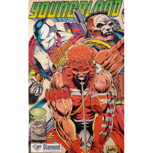
Issues Collected: Youngblood #1-4
Volume Publication Date: 1993
Issue Publication Dates: April 1992, June 1992, October 1992, February 1993
Publisher: Image Comics
I’ve commented before that I enjoy gathering issues and volumes which are more widely accessible to readers, whether through relatively priced Epic Collections and omnibuses collecting Marvel comics, for example, or whatever cheapest version of a trade paperback or graphic novel I can find online or in a used books store (the number of times I’ve wandered into a Half Price Books on a whim and discovered an easily affordable out-of-print volume ridiculously priced at online outlets verges on the miraculous). If I’m reviewing these items, I want the people reading these reviews to have access to them–why share my love for a story or series when others can’t readily enjoy it themselves? At moments, it’s difficult, sometimes impossible, but I certainly make an effort.
But for some of these early Image issues, you’re going to be hard-pressed to find available, affordable printings. Some series, such as Spawn and Savage Dragon, are easier to procure in a variety of formats. The first issues of other series, such as WildC.A.T.S. or ShadowHawk, were printed in small volumes which, for some reason, were surprisingly cheap. Youngblood? Fitting its name, Youngblood will make you bleed. The first ten issues are reprinted in a now-overpriced hardcover volume, and this slim trade, collecting four issues (plus a few trading cards!), was nothing to sniff at either. It’s a weird volume, an "Exclusive Edition" printed by Diamond Comic Distributors sometime in ‘93, and I honestly don’t know how many copies are floating around out there. The volume’s relative size and the strength of its story when compared to its pricing is as disproportionate as Rob Liefeld’s depictions of human anatomy. As a fan of the genre overall, and as a reviewer hunting for material, I felt the cost was worth the purchase, if for content and historical reasons alone. That may not be you. But, hey, at least it comes with trading cards!
I’m not hugely familiar with Rob Liefeld. Oh, to be sure, I know of the man, I’m aware of his work. I know he was the protege of Todd McFarlane, and I even reviewed a Spider-Man/X-Force crossover they collaborated on together (the same one where McFarlane wanted to stab out the Juggernaut’s eye, man). I know Liefeld’s been lambasted online for his distinct distaste of drawing feet and relative ignorance when it comes to correctly scaling the human body, twisting spines and horribly distending Captain America’s pectoral muscles. But as Youngblood #1 was the first issue Image ever published, I wanted to start with his early contributions.
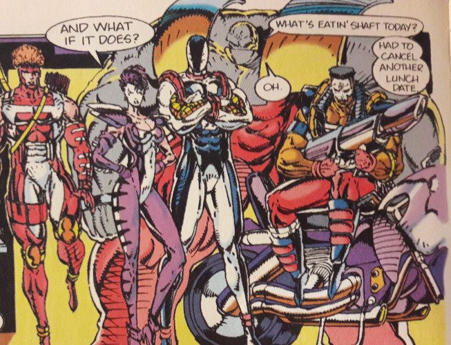
You don’t need me to tell you this stuff isn’t great, but I’m gonna tell you anyway: this stuff isn’t great. In concept, Youngblood has a fairly solid premise: two teams of superheroes, one that stays stateside and cleans up domestic messes (that’d be the "Home Team"), another that galavants overseas and puts down renegade dictators (that’d be the "Away Team"). From the jump, we know Youngblood isn’t some covert operation skulking in the shadows or a group of oppressed superheroes hiding their identities from a world afraid of their abilities. These guys are celebrities. Years before Mark Millar’s Ultimates jokingly (and prophetically) cast Smauel L. Jackson as Nick Fury, Youngblood proposed superheroes as commodities, with action figure lines and interviews and press conferences. It sets the team immediately apart from the competition; these aren't men and women who hide their faces behind glasses or the suave demeanor of a billionaire.
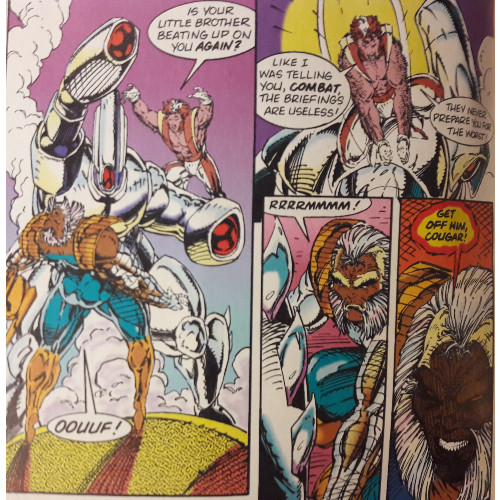
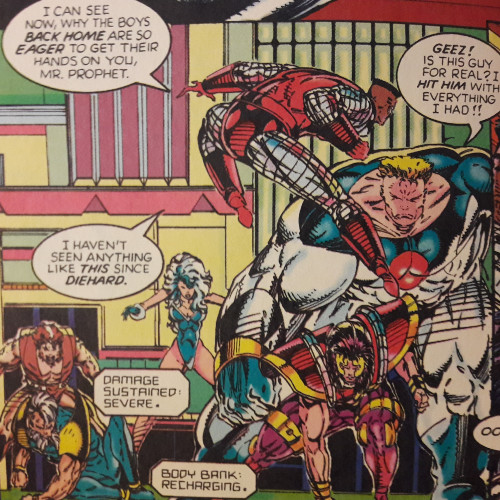
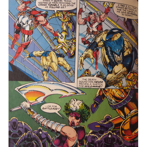
It’s a bold move, throwing us into the heart of an existing universe with very little context and with our heroes already in place. We’ve got no origin stories, few details, not even many real names (the trading cards, actually, possess more biographical details than the issues). Surprisingly, once the novelty of the idea wears off, you start seeing how paper thin many of these characters feel…and how often they seem to be lifted from pre-existing characters from the Big Two. An alien despot named Darkthornn sends minions through "Crash Tunnel" portals while a servant snivels at his side. Diehard, revealed to be the government’s first "genetic experiment," wears a red-and-blue costume and wields a shield. There’s a scruffy dude with claws. An archer. A guy covered in rocks.
The series' "cool" or "wow" factor feels tantamount to these first issues, replacing systematic narrative development. In just four issues, we’re introduced to three different teams of superheroes, two alien races, a cryogenically frozen super-soldier, and hints at Image’s burgeoning universe outside Youngblood’s immediate circle, including nods to Spawn and Savage Dragon and introductions to ShadowHawk, Supreme, and Pitt. And all these fellas have the coolest, most hard-hittingest names you’ve heard: Diehard! Combat! Deadlock! Starbright! Strongarm! Bedrock…whose name was apparently changed to "Badrock" to avoid legal disputes with Hanna-Barbera (and, just in case you think "Bedrock" was a coincidence or accident on Liefeld’s part, the character yells "Yabba Dabba Doom!" when jumping out of a plane). They’ve got big guns and armor and pouches galore…and yet it all just seems so very flashy. Big moments are scattered across the page, sidelining potentially engaging character-driven segments. Heck, the first issue ends with the "Home Team" leaping towards a group of supervillains in a cinematic "team shot"...with no fight afterwards. So not only does Liefeld eliminate sequences where he could develop his characters and their personalities, he skirts around the first possible fight scene. This is, most likely, because the first issue is split between "Home Team" and "Away Team" stories, but at a glance, it also feels like Liefeld was just being a bit lazy...maybe there were too many feet to draw.
Liefeld’s one attempt at introducing deeper commentary does happen in this first issue, when the "Away Team" attacks a Middle Eastern dictator named Hassan Kussein…which may be the least subtle jab at foreign politics since the Joker teamed up with the Ayatollah Khomeini. There’s an understandable core to this, that Image is looking to cross into territory their contemporaries can’t enter. Image is new, bold, brash–let’s throw a level of language, violence, and in-your-face nods to real world events and circumstances others aren’t able to or aren’t willing to address. Let’s have our Hawkeye parody kill a guy with a pen! Let’s have our telepath burst open somebody without so much as a shrug! We’re tough! We’re Image! RAAGH! Yet traversing these dark corners, without much to back up the violence narratively, means you’re just stumbling in the shadows.
I can’t fault Liefeld’s visual creativity, even if everyone’s a muscle-bound meathead with a gun who occasionally looks swiped from Liefeld’s contemporaries. But that’s hardly a defense of good storytelling. It’s more an understanding of Liefeld’s passion, however misdirected it may seem, and his gumption to conceive of a book and then go create it. He’s not just redrawing someone else’s characters. He’s creating the first characters of a new universe, and you have to admire the dedication behind the idea.
Like fellow Image partner Todd McFarlane, Liefeld isn’t primarily a writer…Hank Kanalz is credited with the first issue’s dialogue, with Liefeld taking over scripting duties afterward, and their work seems fairly indistinguishable. Again, like the art and narrative, the writing is brash. If it’s not being used for exposition, it’s often hokey "Rah-rah!" cliches running rampant between characters. Not much time is spent between battles, meaning we learn very little about our assembled protagonists…but can you really learn much about the (at least) 18 superheroes introduced in just four issues?
This volume is a time capsule, and if the stilted story and pouch-packed protagonists weren’t enough to convince you, the letter columns are. Some fans are cautious, acknowledging the book’s faults, yet others are beyond smitten with Liefeld’s vision, pointing to how deeply entrenched comics of the 90s were in their abrasive, action-packed style of storytelling. Everyone loves the coloring, and I can’t fault them: Brian Murray makes each character distinct and easy to spot in crowded scenes. But even in 1992, there’s a sense that Youngblood has a blatant "style over substance" issue, and though I can’t remark on whether the series improved with time, the fact that so little of the original series has been collected (and how few of the volumes that do collect issues exist for readers to nab) indicates Youngblood hardly set the reading world ablaze.
Even this volume, in an introduction, sets the record straight: the series isn’t cutting-edge or experimental, and critics were quick to point out its flaws. And yet the first issue sold over a million copies. Youngblood was a statement: Marvel and DC don’t monopolize the comic book industry anymore! Creators can successfully create comics with characters they own! It’s not a very sophisticated statement, feeling at times like poorly sprayed graffiti defacing a historical monument. And, had circumstances taken a certain turn, I’m sure the graffiti could have been washed off and the monument restored. But you can't fault the creators for their vision: as detailed by an excellent series of videos through SyFy's YouTube channel, these seven men wanted to do something different. And they did! They did it! It's an accomplishment to be proud of, even if the early results weren't brilliant.
For whatever reason–the rabid fanbase of Image’s creators following them from their corporate careers, a glimmer of excitement that Image represented something "new," even a lingering notion that maybe (just maybe) a company like Image could present a more serious turn in superhero storytelling–the company constructed its own lasting edifice. Today, Image is the third highest-selling comic publisher, just behind the Big Two. I’d like to argue that Youngblood, wobbly on its feet, was a prototype for better things to come. Were it not for Youngblood, we may never have received series like Invincible or Saga. Could it just be that, for all its faults, Liefeld’s baby needed to haltingly crawl for others at Image to more confidently walk?